This post is about implementing a reusable angular material table with dynamic columns and table event handling in angular 12.
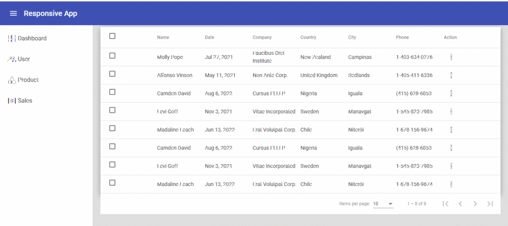
Creating dynamic column in Angular Material Table
let’s start, Add the <mat-table> component to create a table and provide a data source from where the table can get the data to display. You can provide a data source by using the DataSource property. The next step is to create a template for dynamic columns in your Material table.
<mat-table #table [dataSource]="dataSource" class="mat-elevation-z8">

  <!-- table dynamic columns -->
  <ng-container *ngFor="let column of columns" [matColumnDef]="column.columnDef">
    <mat-header-cell *cdkHeaderCellDef>{{ column.header }}</mat-header-cell>
    <mat-cell *cdkCellDef="let row">{{ row[column.columnDef] }}</mat-cell>
  </ng-container>
  <mat-header-row *matHeaderRowDef="displayedColumns"></mat-header-row>
  <mat-row *matRowDef="let row; columns: displayedColumns"></mat-row>
</mat-table>
<!-- table pagination -->
<mat-paginator [pageSizeOptions]="[5, 10, 20]" showFirstLastButtons></mat-paginator>
Next step, we are creating a reusable table component that will require some input parameters to get receive data from the parent component. Here’s what it looks like:
export class MatCustomTableComponent implements OnInit {

  @ViewChild(MatPaginator, { static: true }) paginator: MatPaginator;
  @Output() action: EventEmitter<TableButtonAction> = new EventEmitter<TableButtonAction>()
  @Input() columns: Array<TableColumn>;
  @Input() dataset: Array<any> = [];

  dataSource: MatTableDataSource<any>;
  selection = new SelectionModel<any>(true, []);
  displayedColumns: string[] = [];

  constructor() { }

}
Next step, we need to prepare an array to generate a dynamic column header and need to add two extra columns along with the column which are the checkbox and action column. Here’s what it looks like:
 ngOnInit() {
     // set checkbox column
    this.displayedColumns.push("select");

    // set table columns
    this.displayedColumns = this.displayedColumns.concat(this.columns.map(x => x.columnDef));    // pre-fix static

    // add action column
    this.displayedColumns.push("action");
    this.dataSource = new MatTableDataSource<any>(this.dataset);

    // set pagination
    this.dataSource.paginator = this.paginator;
  }
the checkbox column template looks like:
  <!-- checkbox header -->
  <ng-container matColumnDef="select">
    <mat-header-cell *matHeaderCellDef>
      <mat-checkbox color="primary" (change)="$event ? masterToggle() : null"
        [checked]="selection.hasValue() && isAllSelected()" [indeterminate]="selection.hasValue() && !isAllSelected()">
      </mat-checkbox>
    </mat-header-cell>
    <mat-cell *cdkCellDef="let row">
      <mat-checkbox color="primary" (click)="$event.stopPropagation()" (change)="$event ? selection.toggle(row) : null"
        [checked]="selection.isSelected(row)">
      </mat-checkbox>
    </mat-cell>
  </ng-container>
Whether the number of selected elements matches the total number of rows.
  isAllSelected() {
    const numSelected = this.selection.selected.length;
    const numRows = this.dataSource.data.length;
    return numSelected === numRows;
  }
Selects all rows if they are not all selected or otherwise clear selection.
 masterToggle() {
    this.isAllSelected() ?
      this.selection.clear() :
      this.dataSource.data.forEach(row => this.selection.select(row));
  }
And let’s modify that module file:
<app-mat-custom-table
 (action)="onTableAction($event)"
  [dataset]="data"
  [columns]="columns">
</app-mat-custom-table>
In the component file, As you can see, we declare “columns” and “data” in the ts file that is used to populate data into the table. we want to move some data from the parent component to the custom table component.
export class DashboardComponent implements OnInit {
  constructor() { }
  columns = [
    { columnDef: 'position', header: 'No.' },
    { columnDef: 'name', header: 'Name' },
    { columnDef: 'email', header: 'Email' },
    { columnDef: 'company', header: 'Company' },
    { columnDef: 'country', header: 'Country' },
    { columnDef: 'city', header: 'City' },
    { columnDef: 'phone', header: 'Phone' },
  ]
  data: any[];
  ngOnInit() {
    // get data from API
    this.data = [];
  }

  onTableAction(event) {
    console.log('event', event)
  }
}
Lorem ipsum dolor sit amet, consectetur adipiscing elit. Ut elit tellus, luctus nec ullamcorper mattis, pulvinar dapibus leo.
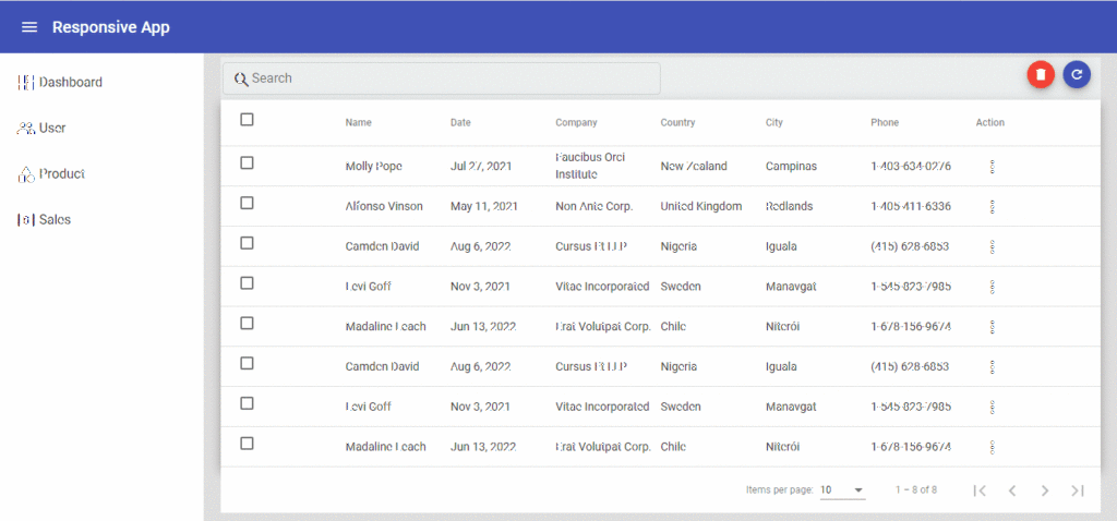
Filter Functionality in Angular Material Table
To filter data source, we’ll need an input field and a custom function. Only then can we use the filter property of MatTableDataSource. We’ll add the following code in the HTML file to implement filtering:
 <div class="search-box">
    <mat-form-field class="example-form-field" appearance="outline">
      <mat-icon matPrefix>search</mat-icon>
      <mat-label>Search</mat-label>
      <input matInput type="text" [(ngModel)]="value" (keyup)="applyFilter($event)">
      <button *ngIf="value" matSuffix mat-icon-button aria-label="Clear" (click)="value=''">
        <mat-icon>close</mat-icon>
      </button>
    </mat-form-field>
  </div>
Then, in the custom component file, create the following function:
 applyFilter(event: Event) {
    const filterValue = (event.target as HTMLInputElement).value;
    this.dataSource.filter = filterValue.trim().toLowerCase();
  }
After these changes, we should have the following result:
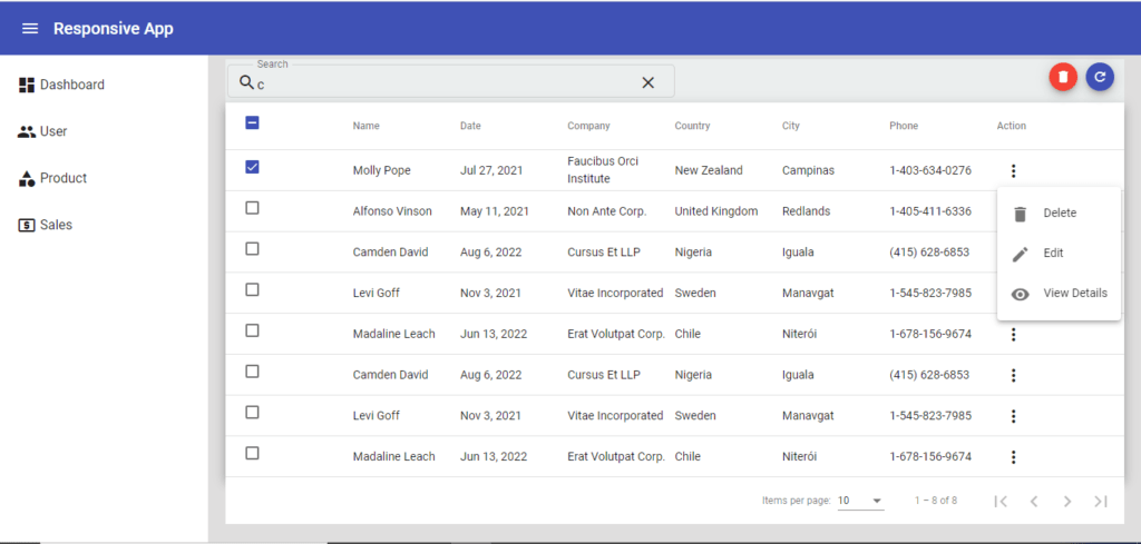
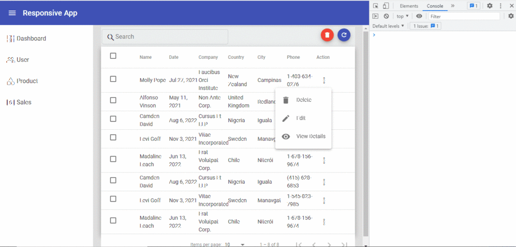
Custom Event Handling in Material Table
For now, let’s continue by creating a child component (“action-buttons”) for the action column template. Here’s what it looks like:
<button mat-icon-button [matMenuTriggerFor]="menu" aria-label="Example icon-button with a menu">
  <mat-icon>more_vert</mat-icon>
</button>
<mat-menu #menu="matMenu">
  <button mat-menu-item (click)="onDeleteClick()">
    <mat-icon>delete</mat-icon>
    <span>Delete</span>
  </button>
  <button mat-menu-item (click)="onEditClick()">
    <mat-icon>edit</mat-icon>
    <span>Edit</span>
  </button>
  <button mat-menu-item (click)="onViewClick()">
    <mat-icon>visibility</mat-icon>
    <span>View Details</span>
  </button>
</mat-menu>
The child component is an Attribute type component and using the same to the mat-call.
 <!-- table action column -->
  <ng-container matColumnDef="action">
    <mat-header-cell *matHeaderCellDef>Action</mat-header-cell>
    <mat-cell *matCellDef="let element" action-buttons [value]="element" (buttonAction)="onTableAction($event)">
    </mat-cell>
  </ng-container>
buttonAction() is custom event of child the component button event which we are handling through the “onTableAction($event)” method.
onTableAction(e: TableButtonAction): void {
    this.action.emit(e)
  }
After event handling in the custom table, we have to pass that event to the parent component and modify that file:
<app-mat-custom-table
 (action)="onTableAction($event)"
  [dataset]="data"
  [columns]="columns">
</app-mat-custom-table>
After these changes, we should have the following result:
Related Post
Source code available for download
The source code is available on Angular Material table dynamic columns and event handling.
URL: https://github.com/decodedscript/angular-material-table-dynamic-columns